Logos are an indispensable part of businesses which helps them in branding. Having the perfect logo creates the credibility of the brand by sending the right message. But, is it possible to design the perfect logo the first time? Generally, it’s not! Companies have different perspectives when they start.
They want to focus more on one thing, the products, and the design of the logo accordingly. But, as they grow and expand, their perspective or vision for the business changes. They might seek to focus more on their branding. They want to send a key message to the audience through their logo since everyone is now well acquainted with their products.
Also, with time, new technologies and creative logo design trends emerge along with the shift in customer behavior. So, not updating your logo according to the present scenario will put your brand’s credibility and trust in doubt.
For all these reasons, businesses need to consider the idea of a logo redesign or logo revamp. They need to do it to make their logo as relevant as possible to their current business situation and make their branding look up-to-date.
Are you a business owner and looking for some guidance to redesign your logo flawlessly? This comprehensive blog will help. Read through this blog to know about the prerequisites for redesigning a logo, how to market it, logo redesign examples and trends, mistakes to avoid, and lots more!
What Is A Logo Redesign?
A logo redesign is a simple revamp or a complete overhaul of the design of the existing logo. Redesigning of a logo takes place because of several business-centric reasons. It could be a larger modification in the products/services, a major change in the brand’s core values or purpose, or the need to upgrade the business with time.
Regardless of the reason for redesigning your logo, the change will impact your brand’s identity. It can cause your target customers to perceive the brand differently than before. It can even affect the branding when the redesign is inappropriate or there are more visual changes. For this reason, you must consider logo redesign ideas that will not affect the perception of consumers as well as stakeholders towards your brand and enhance your visual identity.
When Should You Consider A Logo Redesign?
There is no such ideal time to redesign your logo! The right time to redesign it and give it a new life depends on several factors. If you come across any of the below instances, it is time to redesign your logo.
Need to modernize the logo design: You need it if your company started a long time back and its logo is probably outdated, which no more connects your brand with the audience. In that case, you need to redesign the logo and make it look fresh and updated.
To stay updated with the latest design trends: If your logo was created some time back by following a design trend that is no more relevant today, you need to redesign it. Thus, you also need to redesign your logo when you need to make it fashionable and more appropriate to the current design trends.
Need a change in branding to stand out in the competition: Most businesses change and update their logo for this reason! They may start losing customers due to increased competition in the market. In that case, they decide to revamp and uplift the logo to reconnect with the target audience and also connect with the new audience.
Mission and vision of the business changes: Maybe your business changed its mission to convince target customers. It may have expanded its services or products for which its mission and vision have changed. In that case, the logo needs a major overhaul.
Logo Redesign: 3 Things To Keep In Mind
If you have understood the necessary reason to redesign your logo and did all the research on how to do it, you are now ready to execute it. Remember, it is a big change for your company! So, make sure to hire experts or professional logo designers to redesign your logo. However, when working on the redesign, keep these three crucial things in mind.
1. Avoid comparing it with the old logo
When you are giving a fresh style and design to your logo, do not compare it with your old one to measure its success. Your old logo was also successful since it helped in your branding and made your business prominent in the market. It now needs to be changed for some greater reason. So, don’t focus on outdoing the design of your existing logo. Instead, focus on how the new logo will speak volumes to your customers and represent your brand.
2. Be sure about the final redesign
A change in your brand is going to make you feel different! You can experience two types of emotions. Either you will be nervous and anxious about changing your logo or excited about the new way it will connect to your audience. Depending on how you feel, give yourself some time to think about the new design before finalizing it. Hence, you can be sure of why you are doing the change and what consequences to expect from it.
3. Consider the changes in other elements of branding
A logo is made up of several elements that are colors, icons, fonts, and typeface. When designing the logo again, there will be changes in some elements. If you change the color of your logo or completely redesign it by modifying its size, you should consider the other aspects of branding too.
For instance, you may now require changing your marketing collaterals, such as business websites, business cards, email signatures, signage, business posters, etc. to adjust the new logo into them. Thus, if you are not ready to make changes to these, then redesign your logo while keeping its size, color, and other vital elements the same.
Marketing Your New Logo
Creating your new logo is not the only thing to do! You need to do its marketing to ensure that people become aware of your new logo design and accept it. Good marketing will make sure your new logo is a major hit and everyone connects with it. Here are some of the ways to better market your new logo.
1. Create a buzz
Before revealing your new logo, make your audience excited by letting them know that something new is on the way! You can start a countdown of the days before the final day of disclosing the logo. You can also use some other creative ideas to state the takeoff of something new for your business! This way you can create a buzz and keep everyone’s eyes on your brand. So, when you release the logo, a majority of your target audience will come to know about it.
2. Update all your marketing materials or collaterals
Along with your logo, make sure to update all your essential branding or marketing assets. Businesses require the logo in everything from internal communication to external advertising tools. So, you should simultaneously update all these essential areas where the new logo design will appear.
Discover our listicle, if you are a small business owner & looking for the best marketing materials for small business.
3. Share the new logo on social media
To provide more exposure to your new logo, make it appear on the different social media platforms where the customers spend maximum time. Thus, post about your new design launch on social media. After the release, make sure to post about the new logo and convey to the audience that it is going to be your brand identity for a long time.
5 Key Questions To Ask When Considering A Logo Redesign
If the timing is appropriate for your logo redesign and you have contacted the right team of logo designers for the job, you can go ahead with the redesign process. However, start by asking yourself the following questions first.
1. Has your business expanded or changed?
Is your business taking a new direction by changing its offerings or it is just expanding to new geographic regions/markets? Consider finding a perfect answer to this to ensure that the logo will be fit for your new branding and message.
2. Do you have new competition?
Look whether you have new rivalries in the market. If you have grown several new opponents, you need the new logo to show your customers that you are updated and want to serve them better. Thus, it will only benefit your brand and help you gain more potential customers.
3. Are you speaking to a new audience?
Your brand has an existing powerful and dedicated customer base! But, is your brand prepared to connect to the millennial or new audience with the redesigned logo? You need to think about this and discuss it with your branding specialist before making the move. Together, you should consider a new design that will bind your new potential audience as well as retain existing loyal customers.
4. Have your brand’s values or mission changed?
Maybe the values, mission, or ideals of your brand have changed, which pushed you to redesign the logo. If that is the case, make sure that the new design reflects the new values and mission of your brand. Redesigned logos will never be fruitful as a branding element if they do not represent the transition of their business. So, make your brand look fresh in and out by changing its logo along with the change in your brand values, missions, or principles.
5. Is your logo dated?
If your logo has been around for a long time, it’s pretty obvious that it looks outdated today. It is time to reach your new-age customers with a redesigned logo. The old logo might have a design style that is nonexistent today or looks too simple from the artistic aspect. Many brands also seek corporate logo redesigns to make their logos compatible with digital devices like desktops, mobiles, iPad, etc. Thus, if your logo is not modernized for all these, then it too needs a redesign.
Logo Redesign Vs. Logo Refresh: What’s Right For You?
Deciding whether to how to redesign a logo or refresh it is quite challenging for businesses. Logo refresh implies minor tweaks or changes in the design elements of the logo. You can think of it as a makeover of your logo which gives it a fresh feel and look. For logo refresh, the designers will only do little changes like adding a message, changing the font, or updating the colors. The change in the logo of MasterCard is an example of logo refresh.
Contrary to this, logo redesign is a major dramatic concept. In this, the designer makes major changes in the elements of the logo such as adding a new color scheme, changing the logo shape, or changing the fonts. It even includes changing the branding name, like FedEx. Thus, for logo redesigns, brands need some great marketing moves to establish the essence of the new logo in their branding.
To know which one of the two is right for you, consider answering the following questions.
1. What it is about the existing logo that is not appropriate today?
If your present logo is not appropriate for your branding because your business has expanded, products/services are added, or brand values have changed, then you should consider redesigning it. Also, if there are a growing number of competitors, you need to update your logo to make it distinct and help your brand stand out in the competition.
Also, if you are looking to communicate with a new demographic segment or millennial customers, your logo needs to be redesigned and updated. The new logo will help you connect with new audiences while making your brand still relevant and consistent with the old customers.
2. What are the elements of your logo that shouldn’t be changed?
If you are ready to reconstruct your logo and overhaul its design, consider the key elements that are vital for representing your business to the audience. For instance, you may consider a new design that requires a change in colors, a specific font style, or a shortening of your brand name. In that case, visualize how well the logo will look and whether it will be equally effective in your marketing.
If you cannot assure yourself of such positive impacts, then considering changes in the major elements of your logo might be risky. Then, make subtle changes to make your logo look more vibrant and playful.
3. Is your present logo successful in associating with the customer base?
A great challenge of redesigning logos is that it might disrupt the association that customers have established with your existing logo for a long time. Besides, a logo is visible in all places – in product packages, storefronts, representative uniforms, delivery fleets, mobile apps, and so on. As customers see it everywhere, it gets ingrained in their minds. So, when you think of redesigning, think of the consequence it will have on them. A major change in the design might confuse them and they cannot associate with it anymore. Thus, before taking the step, make your customers aware and establish your new logo as a part of your branding.
The Logo Redesign Process
The logo redesign process is quite same as the designing a logo, except that you need to consider many more things to make it as effective as the previous one. For redesigning too, you need to curate a message, decide on a new style (with some modifications to the old style), define the brand identity, and decide on a plan to release the final logo. But, three extra things that you must keep in mind while starting with the redesign process are- existing logo elements to keep, customer attachment to it, and your purpose for redesigning it.
When you are sure of all these, you are ready for this big move for your business. Here’s a step-by-step guide to help you how to redesign a logo.
1. Establish the reason for redesigning your logo
You should think about a proper reason for redesigning your logo. If you just do it intentionally without a reason, people may perceive a wrong idea about your brand. They might consider your branding inconsistent.
Doing it purposely gives your customers a positive impression of your brand. They will consider your brand to be up-to-date that seek innovation to stay at the forefront of the industry. This establishes your professionalism and helps to gain the trust of customers. However, for this, you should convey the reason for redesigning your logo through effective marketing beforehand.
2. Perform a brand audit
Doing a brand audit is vital to ensure the logo redesign is a signification success for your business. The audit must cover the aspects of internal branding and external marketing. Internal branding relates to the use of the logo in communication means, emails, policy documents, doors and reception signage, placards, notepads, devices, employee ID cards, uniforms, and so on. On the other hand, external branding relates to the use of the logo in major marketing elements such as billboards, print ads, social media, email marketing, websites, business cards, letterhead, product packages or labels, client communication, etc.
The audit should cover both aspects but more carefully the aspects of external branding. It helps you to evaluate the current positioning of your brand and where the logo is used. Therefore, you can plan the redesign well ensuring that the new logo fits with your external and internal branding. You can easily decide what to keep and what to change in your logo. The brand audit also makes you aware of possible branding opportunities which you can utilize to create a strong identity.
Another aspect that you can evaluate in your brand audit is ‘customer experience’. You can conduct a small survey to gather insights on customer experience regarding your logo. Ask what they perceive about the logo. You should have some customers as well as non-customers in the survey. The latter group will help you know what your logo looks or feels like. You can also ask the customers whether your existing logo is good or bad than the competitors’ and why. That way, you can identify the areas to improve in your old logo with the redesign.
3. Decide what you want to change and how much
Following the brand audit, you are left with all the crucial findings about your logo, which will help you decide what to change in it and how much. To determine the change required, you have to consider the demographic characteristics of your customers. For example, if your customers are young and aged within 35 years, you might consider changing the black and white font of your logo or raster-based design because they are outdated today.
People tend to develop their tastes and preferences faster as market trends shift. Going by an outdated logo means your brand is incapable of catching up with the market pace. Thus, you need to adapt your logo design as soon as you recognize changes in the market or the preferences of your customers. Analyze how their preferences have altered to decide how much you want to change the logo.
Take the finest example of Burger King. The company experienced a major sales decline and that made them decide to do rebranding by changing its logo to some extent. You can notice the logo wasn’t changed too much! Only the blue swoosh around the burger icon was removed as the color does not relate to food. Except that nothing much changed as the preferences of target customers remained more or less the same. Only the burger buns are made more orange to make them more tempting to the customers.
4. Identify what elements you do not want to change
After you have identified what to change, you should also determine what not to change in your logo. So, before you start with the logo redesign process, identify the recognizable elements which represent your brand values, message, or purpose. This will also help you determine how you can adjust these elements with the new concept of the logo.
While keeping the elements is easier, many brands fail to blend them smoothly with their new design idea, which makes the new logo look odd. This can severely affect your branding. To avoid such mishaps, make sure to choose a professional logo design company that will redesign your logo while keeping its pivotal elements untouched and adding new elements gracefully. That’s how you can keep connections with your existing customers while attracting new customers.
One of the biggest examples of the worst logo redesign is that of GAP in 2010 which was then restored to its previous design within a week after immediate customer backlash. The logo contributed to the salience of the brand, and it is a key way to recognize this prominent brand. That’s why customers felt the brand identity to be depleted with the redesigned logo and hence, refuted it.
5. Find ways to get feedback
At this step, you should start with the logo redesign process with the help of your chosen logo designer. Ask the designer to share the design at every step. You should gather some audience from amongst your loyal customer base to get valuable feedback on your logo redesign. You can organize a focus group discussion for collecting feedback at every step. So, you will know what is going wrong and your designer shouldn’t go for it. Similarly, you can know what is right and can be improved further in the logo.
To help the designers better understand the feedback, make sure they are actionable, specific, and can be visualized. For instance, general feedback like the color is bad is not appropriate. Instead, the reviewer should provide his or her opinion with an actionable plan for that. The feedback should specifically point out what elements of the logo are good or bad. If they could provide some live examples of what they want to see in the logo, then it would be even better for the designers.
6. Monitor the performance
You have finally recreated or redesigned the logo! It is now time to launch your logo and make it public. However, instead of getting overwhelmed or excited about the successful launch of the logo, track its performance in all of your branding aspects, which include social media ads, print media ads, website impressions, and so on. Continue tracking the performance of your branding and collecting customer feedback for some time after the launch.
The best way to monitor feedback is to watch out for the responses on different social media platforms. It allows you to get feedback from the masses, including customers and non-customers. Thus, you will know how everyone feels about your redesigned logo and whether it’s universally accepted.
Mistakes to Avoid While Redesigning Logo
Redesigning your logo seems a simple task if you have considered the right purpose and key elements to keep or change in your logo. However, many businesses make mistakes while redesigning their logos and you should avoid making them. One mistake and your redesigned logo could break your business! So, be careful and try to avoid all these mistakes.
1. Designing your logo by yourself
Bad logo redesigns happen only when the owners or marketers do it by themselves. Since redesigning only needs some minor changes, they think they can do it themselves. But, rarely could you do it right by keeping up the real meaning of your logo and including the new elements. So, contact a professional logo redesign agency for it.
2. Forgetting about the target customers
Whatever new colors, icons, or font style you choose for redesigning your logo, make sure your customers can still connect with it. Forgetting about their preferences and making the logo only appropriate to your brand will not be successful.
3. Copying the competitors
Never make the mistake of copying your competitors! While trying to make your logo the finest among them, you will lose the individuality and uniqueness of your logo.
4. Not emphasizing the fonts or colors
The colors and fonts of the logo are equally important as the icons or elements. Colors exemplify many emotions or feelings and fonts make your brand message convincing. Thus, don’t just choose any color or font! Choose the ones that are relevant to your brand.
5. Do not clutter
Lastly, do not try to communicate a lot of things with your logo and clutter it. Keep it plain and elegant to convey a straightforward message about your brand.
What To Do With Your Brand New Redesigned Logo?
Once you are done with your logo redesign, the next thing that comes instantly to your mind is what to do with it. It means you should decide how to introduce it and make it your formal brand identifier. Also, you have to update the new logo across all digital platforms, marketing collaterals, products, and company materials.
So, the faster you launch the new logo, the better it is. You could quickly start with the rebranding, making the audience all over the world embrace the new design. Here’s a quick checklist of the things to do after redesigning your logo.
1. Update the logo on your website, which is the foundation of your digital presence.
2. Change the profile pictures on different social media platforms, including Facebook, Instagram, Twitter, Pinterest, etc. This promotes the consistency of your branding!
3. Get all the print marketing materials updated with the new logo. If you still go on with materials printed with the logo, it will display your unprofessionalism.
4. Inform your third-party services providers or suppliers about the new design and ask them to do the necessary changes in packaging materials and distribution channels.
5. Update all your local listings including Google My Business listing to make new customers aware of your latest logo design.
6. Put up the new logo on company signage and important places like storefronts, reception, gates, etc.
20 Most Successful Logo Redesigns
If logo redesigning is on your mind and you want to avoid making one of the worst logo redesigns, then follow these successful examples. These are logo redesigns attempted by some of the most prominent brands around the world. From these logo redesign examples, you can figure out why they did so and can get some valuable ideas to breathe fresh life into your own.
1. Mastercard
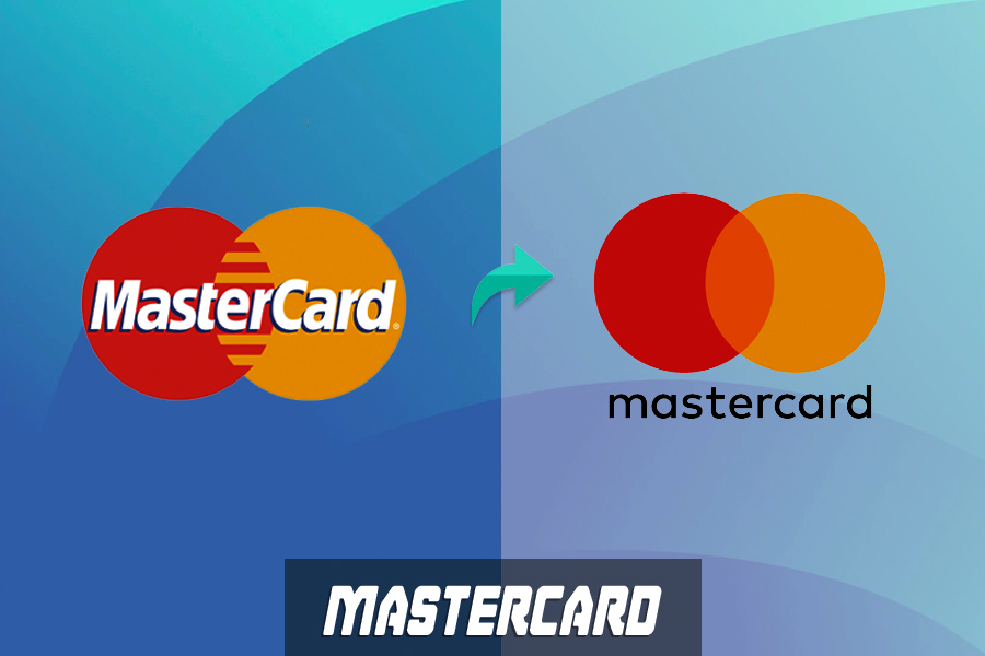
This is perhaps the best example of effective rebranding with a logo revamp! The company remade its logo while preserving its identity and emphasizing the simplicity and seamlessness of its payment services. Redesigned by a famous branding company, Pentagram, the interlocking circles are made more vivid in the new design which focuses on the connectivity of the credit card company with consumers all over the world. The basic circular shapes convey inclusiveness and universal accessibility.
Clearly, in the new design, the brand kept the elementary shapes in the same form. It only separated its name and placed it below the circles to represent the iconic name of the brand in the purest form.
2. Netflix
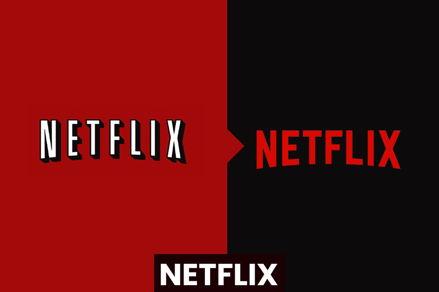
The step to redesign the logo was essential for the company when it shifted from being a mail-rental DVD service provider to a digital content provider. It decided to redesign due to a massive shift in its services. It became a prominent video-on-demand and streaming service company, offering subscription-based services. The rebranding was needed to make people aware of its significant change.
However, the Netflix logo was recreated with minimalistic changes. The brand colors remained the same. Only the new logo is made more crisp and bright so that it is clearly identifiable on every device where people access the platform and watch videos.
3. Meta
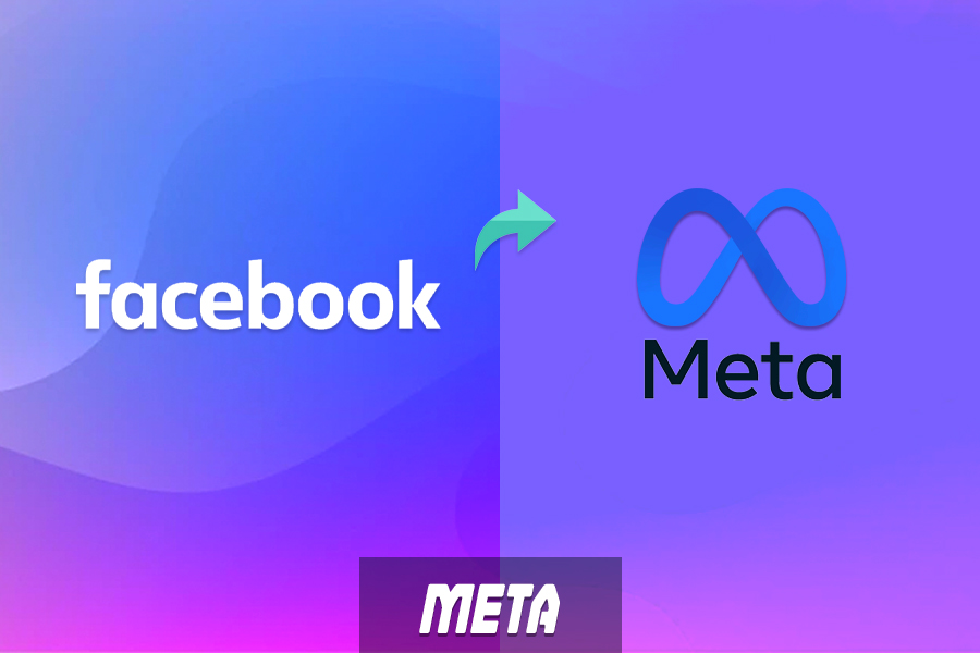
Meta, formerly Facebook, is one of the best rebrandings ever as it marks the extensive change in the social media landscape. The name Meta with the infinity symbol is a major change over the Facebook text. While Facebook is ingrained in your mind since the time we started using social media, the new name was quite successful to catch everyone’s attention.
The change in the name was necessary as Facebook is no longer just a platform for connecting people. It today helps businesses in branding and advertisements, allows people to buy/sell products, creates social awareness, hosts live shows, and many more! To encompass this concept of universal applications of Facebook, transformation to Meta was essential. The infinite sign in the new logo has made the message loud and clear, in the most simplistic way!
4. Burger King
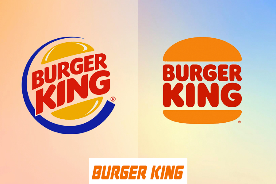
This is one of the most remarkable redesigns made in recent years. Burger King is a renowned brand in the fast-food segment. It made changes in the logo after a considerable dip in sales due to increased competition in the industry. It thought to up its game amidst the competition by replacing its multi-colored logo with a more realistic and simplistic one.
In the new logo, the blue border was removed as the color does not relate to food in any way! Instead, it made the burger buns more orange, with the brand name crammed in the middle, just like the fluffy patty in the burger. This modern version of the logo is undoubtedly more tempting and so helped in the successful rebranding of the fast-food giant.
5. Slack
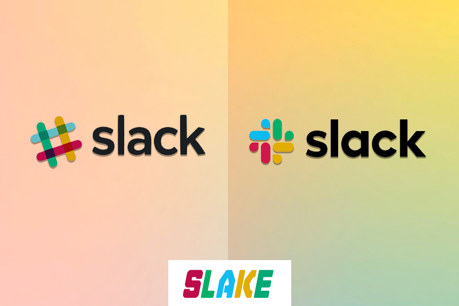
Slack improved its logo for the sake of making the brand vision and message clearer to the world. If you observe old and new versions of the logos, you cannot spot many differences. Only the font is made bolder and the iconic design is made more seamless and expressive.
The new design for all the simplistic changes and minimalist approach looks is helping the brand to build a cohesive identity. Besides, the redesigned version appears better as an app icon on mobiles or desktop screens.
6. Taco Bell
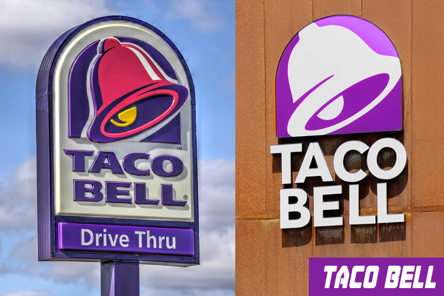
Taco Bell is a notable global franchise in the fast-food sector known for its iconic products like Doritos and Locos Tacos. It moved ahead with the same logo for more than 20 years. However, the brand felt in 2016 that some modifications were necessary to remain relevant to its loyal customer base, which mainly comprises millennial and Gen-Z individuals.
The company subtly changed its logo design to remain as recognizable as before. In the new logo, you can see the colors are refined making the bell icon more precise and the brand name clearer.
7. Renault
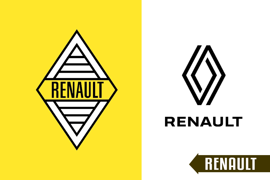
One of the successful car manufacturers redesigned its simplistic logo to add a dynamic feel which was lacking earlier. This is one of the best logo redesigns that made use of negative space and played well with lines.
The Renault logo redesign showed how you can define depth and movement in a flat design.
\The double geometric lines are placed in a creative way to resemble the earlier design as well as symbolize the wheels on the roads. Thus, it gave this new logo a sense of continuity that is effective for the branding of an automobile manufacturing company.
8. Volvo
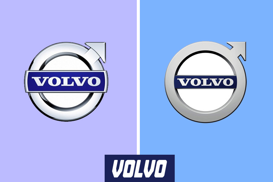
The Swedish car company redesigned its logo in 2021 with a minimalist approach. This move in the branding was necessary when it decided to go for its first public offering for raising cash and accelerate its shift to fully electric cars. It made its logo flat designed after other giants like Kia, VW, and Nissan made a similar move.
The new design did not change the old iron mark but only refined it with the digital retro trend that was quite popular then. This new and stripped-down version of its earlier logo has made the luxury vehicle manufacturer update its brand identity.
9. Paramount
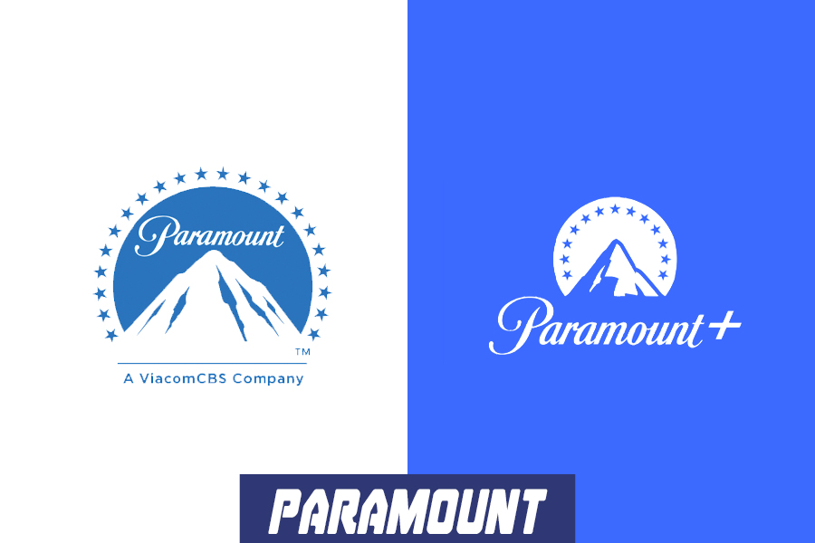
Paramount Global, a premium entertainment brand that connects billions of people across the world with its content has updated its logo to give it a modern feel. A lot of age-old companies are redesigning their logos with the digital retro concept to make them look modern while retaining the vintage feel at the same time.
The logo redesign for this historic entertainment company was necessary as it shifted its focus to building a streaming platform. The new logo is flatter with a slight change in the color shade. It has neither lost its meaning nor the old charm and nostalgia.
10. Magnum
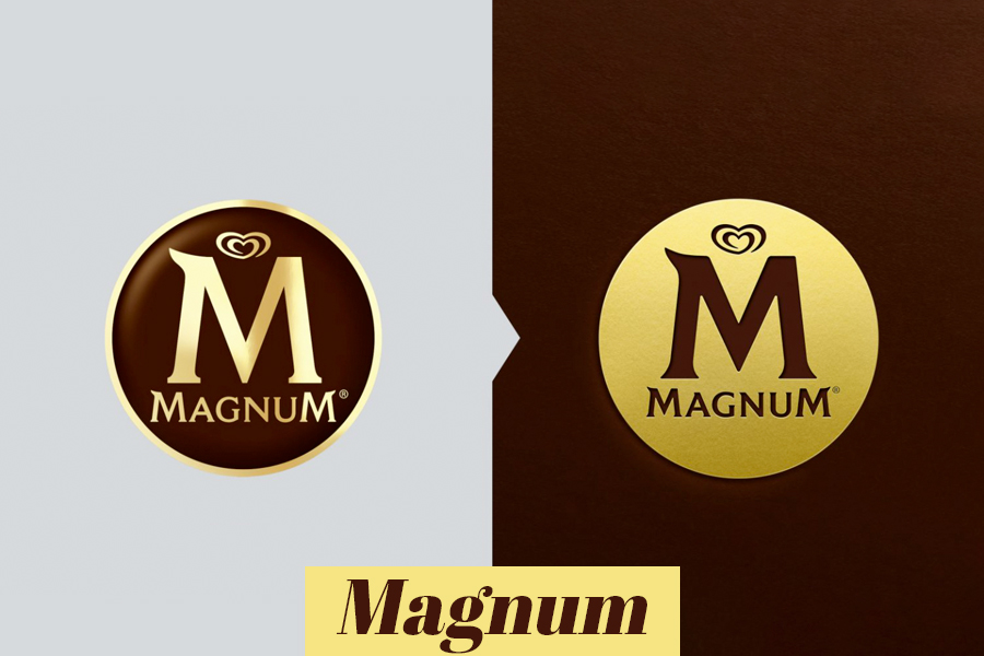
This irreplaceable ice cream brand took the step to redesign its logo to make it more sensuous and more relatable to premium ice creams. The new logo intends to send a message to ‘calm down’ with its subtle design to tempt consumers.
To retain the authenticity of the brand, nothing is changed about the M letter and icon of the logo. It is only an inverted version of the old one, where the golden color is made the base of the logo. The new logo looks like a stamp of gold which portrays the richness and sophistication of the brand. In many ways, this new one is better and loved by all!
11. Baskin-Robbins
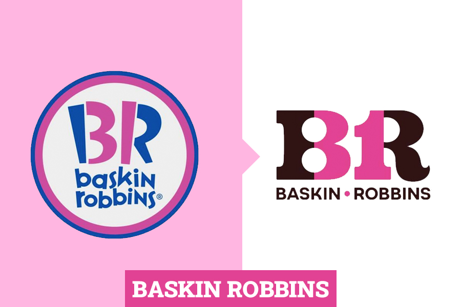
This is another king among the ice cream companies that went through a logo transformation in the year 2021 to appreciate its humble beginnings in the late 1940s. The logo was then made with circus-inspired typography with the colors of two famous flavors- strawberry and chocolate. The design underwent many changes and looked quite modern in pink and blue in its last design. But, the brand felt that it is losing its significance and the unique potential to pass through generations ensuring the same level of quality.
With an urge to create an unforgettable visual identity, it redesigned its logo taking it back to its old form but with some freshness. With this redesign, the brand wanted to remind people about the quality and satisfaction that they assured for years. This move was successful as it excited the people who grew up with the brand as well as the young consumers.
12. Campbell’s
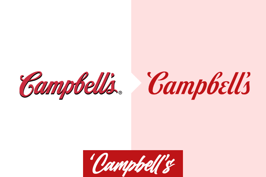
The brand took the step to redesign its logo after the pandemic made us homebound and foodie. It was a move to uplift the branding of this famous soups and snacks company. The redesigned logo is not much different but gives more space for the letters to breathe. As a result, the logo looks clean with wider kerning and makes the trade name more visible.
While the company promotes the idea of celebration with good food, this new simplistic yet vibrant logo does justice to its branding.
13. Domino’s
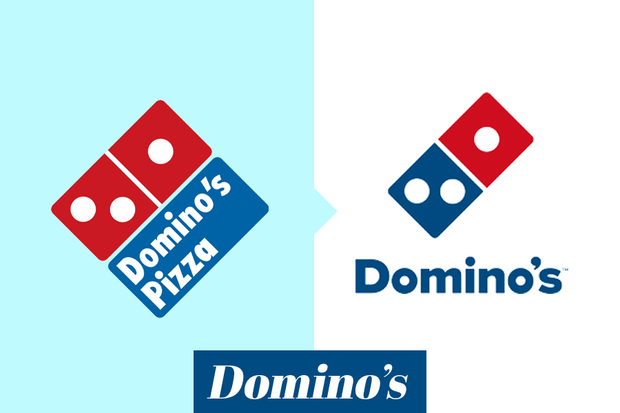
It is one of the most successful logo redesigns that resulted due to the change in the brand’s offerings. Domino’s pizza, the ultimate stop for fresh-out-of-the-oven pizzas made a drastic change in its logo by dropping the word ‘Pizza’! The reason is quite apparent! The brand no longer confined itself to delivering a variety of pizzas.
It was more than that. It provided everything from pasta, fries, wings, nuggets, choco lava cakes, and many more. So, rebranding was necessary.
The new logo helped consumers to relate to the drastic change of the brand from a popular pizza company to a multinational restaurant chain in 2012.
14. Pizza Hut
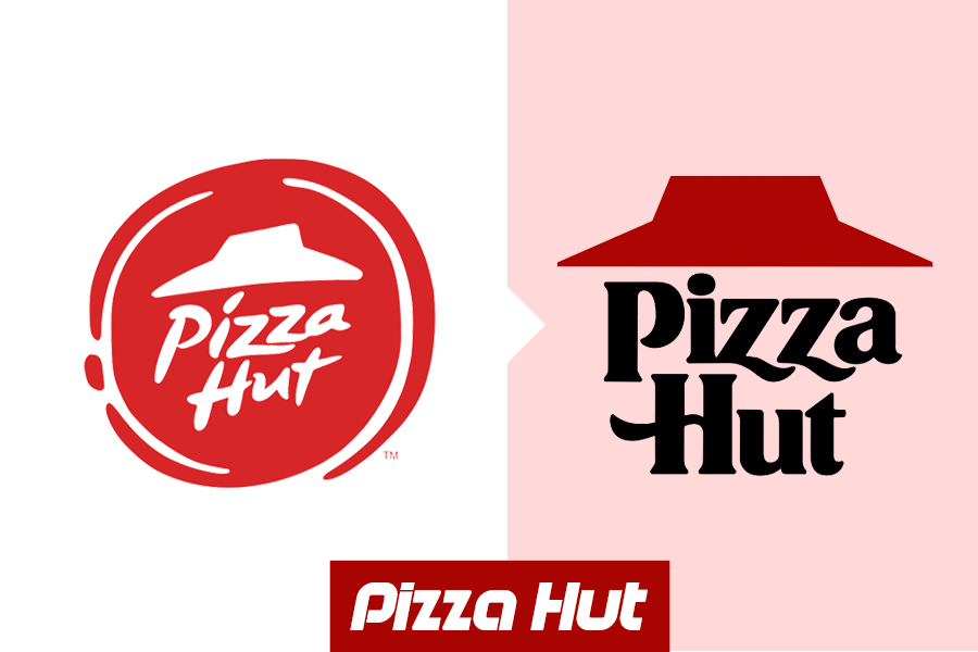
Pizza Hut redesigned its logo several times while preserving the key elements of the original version. It has the signature slanted red roof which signifies ‘hut’ and a pretty much playful font. At some point, it was redesigned to put the entire theme within a pizza-like emblem in red. It was quite modern.
However, the brand thought of reverting to its oldest vintage logo to restore its rich legacy. This step was necessary since the company’s sales declined after Domino’s started to rule the market. The current logo features the roof more vividly and the fonts are bolder in black. By tapping into the sentiment of nostalgia, it tried to win the hearts of the customers and revive its market share.
15. Upwork
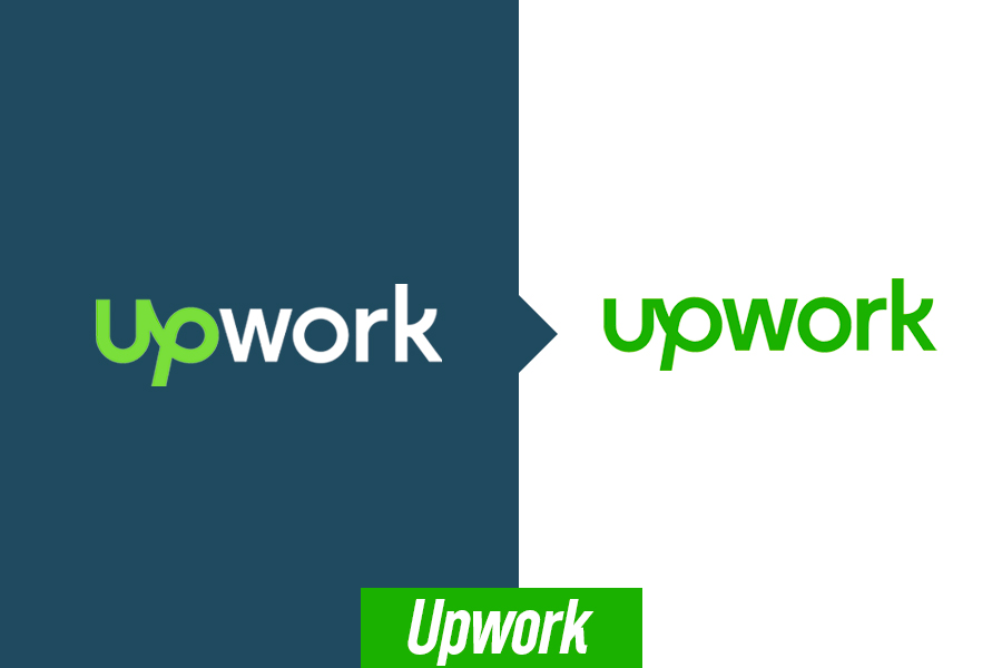
Upwork made some simple modifications to its logo and gave it a fresh look in 2021. It just replaced the black color of the ‘work’ fonts with green. Thus, the logo is fully green now which gives it a unified look. This was made due to the brand’s ambition to turn into a global freelancing platform and a verb like Google, Photoshop, or Uber. While the design is a lot more elegant than before and loved by freelancers, how well it will fulfill the ambition of the company is worth watching!
16. Udemy

Udemy redesigned its logo by making some noticeable changes. While the brand name and font type remained the same, there is a purple arrow in the logo that points north. It speaks volumes about the brand, which is a globally-known online teaching and learning platform. The upward arrow resembles the great truth that ‘Knowledge uplifts us, whether you share it or pursue it’.
The new design of the logo captures attention worldwide for its meaningful addition. Many also relate the upward arrow as a symbol of growth which they can seek with the learning platform. Therefore, Udemy could not have done it better!
17. TripAdvisor

TripAdvisor started as a major travel review website that provided a complete guide to travelers and trip organizers. However, today, it is more than just a review website. It offers flight-search services and personalized holiday packages with rental cars and sightseeing experiences. This compelled the brand to redesign its logo and mark the start of something new.
The updated version of the logo retained the iconic owl mascot but the design is toned down and made pretty sleeker than before. In addition, the circular shapes (of the owl’s eyes) are now designed in black on a green circular backdrop which makes the logo more noticeable as an app icon on mobiles. The company emphasized redesigning its logo following the expansion of its services to make it more visible in print in travel-related businesses like restaurants, cars, and location entrances, where they tie up. It helped customers to recognize their brand.
18. Chevron
![]()
This is also one of the finest examples of logo redesign and refresh. Chevron, a world-famous oil supplier and multinational company which was founded in the 1870s changed its logo several times as a part of its branding. While the name dictates the visual identity of the brand, their logo was simplistic yet meaningful to the core. The red and blue wide downward arrows that look like a patch on a military uniform are bold enough to symbolize the significance of the company.
In the new design, not much is changed. The arrows are provided with gradients to make them look brighter. It is clear that the global company only wants to give a modern look to its logo without losing its original characteristics.
19. Lego
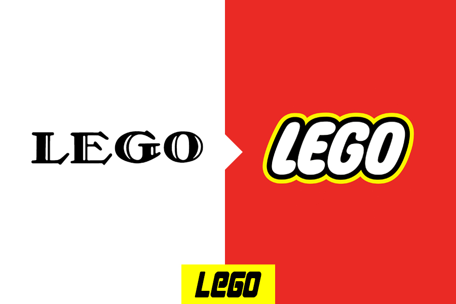
Most of us grew up playing Lego! It was a favorite part of our childhood. And like us, the Lego logo has also grown and changed through the years. The biggest change happened in their logo much earlier in 1973 when it made the design much simpler to make the brand easily recognizable. Since then, there have been little tweaks in the design which included changes in the font style, adding an outline, and softening the color tone.
The final redesign holds the legacy of the brand and uplifts its visual identity successfully all over the world.
20. Marriott Hotels
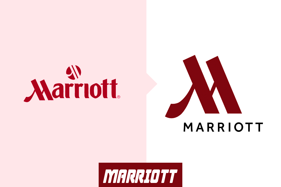
Want to see a superlative logo redesign example that changes a lot from its old version? Check the previous and new versions of Marriot Hotels. This spectacular multinational chain of luxury hotels made dramatic changes to its logo.
It earlier focused on the word “Marriott’ and a small symbolic M on top of that. In the redesign, the brand shifted the whole focus of the logo to ‘M’. In the new logo, M looks tall and elegant in the burgundy color and looks like a Monogram. The word “Marriott” is kept in the design below the letter M to make the name unforgettable.
The Monogram idea and transformation of the logo were essential to keep the logo easily suitable for printing on hotel signs and merchandise ideas like plates, cups, uniforms, and towels. So, in addition to making their logo distinguishable, it also made their boutique hotel chain identifiable.
Logo Redesign Trends We’ve Noticed In 2022
If you are planning to redesign your logo to up your branding game, then go by the latest design trends. Some of the trends that made a mark in 2022 are given below:
1. Bright colors
Many brands went for a vivid design with bright colors that allow the brand to vibe with the younger audience. Besides, it makes the logo dynamic which is more appropriate for display on mobile screens and other digital devices.
2. Geometric shapes
They are the building blocks of graphic design and each shape has a meaning. Many brands are playing with classic shapes to symbolize their products in the logo.
3. Monograms
They have typically become the trendsetter in logo design. Monograms are simplistic lettered logos, mostly in black that convey the brand’s simplicity, class, and professionalism. Many brands are redesigning their logos with simple font styles and monogram characteristics for this reason.
4. Negative space
This trend implies the use of blank space around the key elements of the design to produce a message or reflect a critical branding aspect. Companies redesigned their logos using up the negative space and showing their creativity.
5. Gradients
Gradients help logos to become more vibrant and stand out. This trend was mostly embraced by tech companies, mobile apps, and gaming applications. Old brands are redesigning their logos with gradients to make them look modern without losing their classic design.
Get An Appealing Logo Redesign with Tampa Clothing!
Logo redesigning is quite a dicey thing to do for companies! It can make or break their business. The key purpose for redesigning your logo is to strengthen your branding while it expands, adds new products/services, meet the market trends, or outshine the competitors. So, redesign your logo to suit your purpose and ensure that it connects well with your old and new customers.
Keep this logo redesign process in mind to avoid any pitfalls or blunders. But, the most crucial step is hiring a competent logo designing agency that will redesign your logo as per your specific reason! We, at Tampa Clothing, can help you with quality services when it comes to redesigning your logo.
Our team of expert logo designers will carefully evaluate your brand and distinguish the elements of your logo that should be kept and the ones to be changed. Our experts keep up with the latest design trends and so will make sure to do a logo revamp to make it fully relevant to your business, customers, and the present scenario.