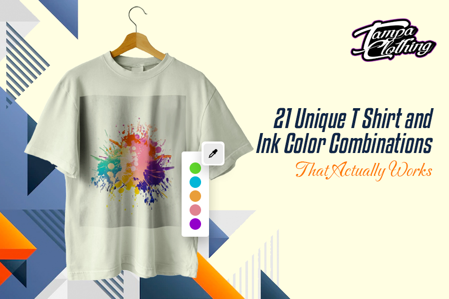
The biggest difficulty that one faces while getting a T-shirt printed is choosing the ink color to use in its design! T-shirt, and ink color combinations matter the most for businesses.
The audience perceives a brand from the color of its logos. While you know the color(s) of your logo, you need to carefully pick the color of the T-shirt for a striking yet unconventional combination.
Custom-printed T-shirts are becoming essential merchandise for brands or companies. One of the key benefits of promotional shirts or custom t-shirts is that they help their people to feel connected and promote their brand wherever they go.
So, you should be dedicating some time to decide the T-shirt and ink colors that will make them go well together. Custom-printed T-shirts are also worn by family members or groups of people during a special event or occasion, to mark unity among them.
Whether you are planning to design merchandised T-shirts for your business or custom T-shirts for your family occasion or group event, this blog is an interesting piece to read.
It helps you decide on an ideal design combination for your shirt by exploring a wide range of several shirt and ink combo ideas. Take a look:
Table of Contents
ToggleKnow The Color Wheel Basics
Before you choose the T shirt colors and ink colors for your custom T-shirt, you must grab some idea about the color wheel. Constructed by Isaac New Town, the color wheel helps the designers and artists determine which combination of colors looks good together.
The wheel represents a logical structure of the colors, according to the shades. There are mainly three parts or primary colors in the wheel – red, yellow, and blue.
There are three secondary colors, which are formed by mixing the primary colors- green, orange, and purple. Both the primary and secondary colors mix into six tertiary colors. So, in total, the color wheel comprises 12 colors.
Newton placed the colors in the wheel in a harmonious way that artists, or designers can use to find great mixes and palettes.
If you draw a line through the center of the wheel, you can easily separate the warm and bright colors. And then there are other distinct clothing color combinations that you can get from the wheel.
1. Monochromatic Colors
These represent the color schemes where a single color is used in various tones, such as light, dark, semi-dark, or darker.
2. Analogous Colors
Analogous colors are groups of three consecutively placed colors in the wheel, such as the Yellow group (Yellow-Green, Yellow, and Yellow-Orange), Red-orange group (Red, Red-Orange, and Orange), and Violet group (Red-Violet, Violet, and Blue-Violet).
3. Complementary Colors
Two colors that are just oppositely placed in the color wheel are complementary colors, such as red and green. Since there’s a sharp contrast between the two colors, they make an interesting eye-popping combination when used in a design.
4. Split Complementary Colors
Adding one more color to the combination of two complementary colors will give split complementary colors. It is having three colors instead of two in the complementary color palette. The color combination is made by choosing one primary color and then choosing two adjacent colors from the opposite side.
5. Triadic Colors
The triadic colors are the three evenly-spaced hues on the wheel that will together yield a bold and outstanding combination. A perfect combination of triadic colors is Red, Yellow, and Blue or Purple, Green, and Orange.
6. Tetradic Colors
Tetradic colors are the four evenly-spaced colors in the wheel, combining which will give a vibrant color. It best works when you use a tetradic color combination with adjacent soothing colors. A good example of a tetradic combination is red, green, blue-purple, and yellow-orange.
To choose the best color combo for clothes or T-shirts, you need an in-depth understanding of the color wheel and all the color combos that it represents.
If the basics of the color wheel are quite clear to you, now you can move forward to explore some of the best T shirt and ink color combinations that will take your custom T-shirts to the next level.
21 Best T Shirt And Ink Color Combos
While choosing a color for your cloth and ink, choose something quite cool and different. Together, they will make your T-shirt look one-of-a-kind.
If you are looking for good color combinations for clothes, here are some of the popular and uncommon combinations for you.
1. Blue and White
It’s one of the most common combinations for any cloth or T-shirt, which is never going out-of-trend. That’s why we chose to put it on top of the list. Blue is a sign of balance and peace. Any shades of blue, dark, or lighter ones are calming and define harmony or accord.
Many brands, especially in the field of technology, electronics, health, and education used color to design their logos to represent the sense of stability in the service and growth.
No doubt, blue goes best with white! Whether you want to print a name or an image in blue, choosing the white color T-shirt as the background will enhance it. Similarly, if your logo, text, or image is in white, pick only blue color shirt because both colors work brilliantly together.
2. Blue and Yellow
If your design is in yellow, choose a starkly contrasting T-shirt. Yellow and blue make a great contrast. And, blue means almost all shades of blues, i.e., navy, dark, sky, indigo, sky, teal, and slate, which will go well with yellow.
However, if your design is in light yellow, do not use lighter shades like artic and cyan.
Blue and yellow are complementary shades too. They make a soothing combination that is pleasing to the eyes. The cool tone of the blue and the warmness of the yellow together will create an exceptional color balance for your shirt.
3. White and Grey
If you want a subtle clothing color combo, choose a grey T-shirt with a white design. White creates a balance with any color but looks best with grey. It is a neutral combination but extremely classic.
Most brands in the education, technology, finance, and other services sectors who want to exhibit their professionalism to the audience use this timeless color combination. Clothing with this color combination is an ideal choice when selecting gifts for male coworkers, as it effectively showcases their commitment and professionalism.
White and grey together make the design sophisticated and define the maturity of the brand. Check the logo design of Apple or Forbes, and you will know! So, choosing the grey and white color combination will exhibit the refinement of your brand and make the T-shirt or apparel look sophisticated.
4. Maroon and White
Maroon and white together can be one of the finest T shirt and ink color combinations. Do you know why? Maroon is generally a darker shade of red and black. So it adds vibrancy to the design while the white adds some cool quotient. Together they make a high-contrast design that is attractive to the eyes.
If you are using this color combo, make sure to choose maroon for the T-shirt and white for the design. The maroon shirt will be great as a background as it will let the design in white shine bright. This is especially recommended for T-shirt or sweatshirt printing that needs a design in thin lines.
5. Blue and Grey
f you need a simple and comforting combination, choose blue and grey for your T-shirt! Blue colored shirts with grey design or grey shirts with blue design, both will be equally cool. While the grey shade is sophisticated, together with blue it will make the T-shirt extra calming.
Both are the favorite colors of popular brands that want to represent steadiness and refinement in their logos. With many shades of grey and blue available, you will also have infinite possibilities for your design. Thus, if you want to make your T-shirt look simple yet urbane in design, choose grey and blue as your T-shirt and ink color combination.
6. Red and White
If you want to create some oomph factor with your printed merchandise, be bold and choose red with white! This two color combination T-shirt will make your T-shirt design pop and chic.
Choosing red colored shirts and using white as the ink color makes more sense for this color combination. Whether you want an image or a design with delicate lines, doing it in white ink on the red color T-shirt will make the apparel look stunning.
With wide varieties of red shades available, like cherry, wine, blood, blush, berry, and candy, you can choose the shade that goes well with your brand persona. Red and white combo T-shirts are also the best-customized gift apparel for loved ones, as the color signifies love.
7. Pink and White
Pink is probably the best color for T-shirts when you want to print merchandise for a dessert brand, such as candies, ice creams, or cakes. It is also a great choice for T-shirt merchandise for female-oriented brands, like cosmetics, fashion apparel, and accessories. It is a softer hue and represents delicacy and beauty.
The pink color shirt needs a design in white ink to make the T-shirt look sweet and gentle. Pink also symbolizes playfulness and innocence.
That’s why you can spot most babies’ or children’s brands using the color. Together with white, pink will make the T-shirts apt for wearing in events that relate to kids, women, or anything that resonate with energy and passion.
8. Red and Maroon
If you want a monochromatic design for your T-shirt that is also intense and attractive, choose the red and maroon combination. Seems oddly contrasting, right? Since both are available in many light and dark shades, make sure you choose a lighter red for the T-shirt and darker maroon for ink or vice-versa.
Red is the color of royalty, and maroon has connotations like passion, depth, or force.
So, together they make one of the boldest T shirt and ink color combinations, which is awesome for shirt designs. They can make a strong, and everlasting impression on the audience.
9. Green and Yellow
Green is an earthy color popular for its aesthetic feel, while yellow is a brighter shade that radiates positivity. Therefore, combining the two colors for your T-shirt will give you a more vibrant design. Make sure to choose green for the T-shirt color and a sweeter shade of yellow for the ink.
The green and yellow combinations work best for brands that sell organic products or promote environmental sustainability. This is also one of the best shirt and ink color combo ideas for youthful activities, or outdoor activities, like gardening, marathon, and hiking.
10. Green and Grey
While it shows sophistication and professionalism in choosing grey-colored shirts, putting the design on it in green ink is sure to make them different and eye-catching. Grey is one of the most popular T shirt colors used by brands for their merchandise. But using one of your favorite green shades for the design will make your T-shirt look novel.
Green will especially look awesome if you have a proper image, icon, or bold text to print on the shirt instead of thin lines. It’s simply better to have more soothing green on the humble grey background, which will make the T-shirts look too good as brand merchandise or event attire.
11. Red and Yellow
Red and yellow together is a common clothes color combo, but you can hardly see them for branded merchandise. While red and yellow are both brighter hues and are placed adjacently in the color wheel, choosing the two shades together for shirts may not seem appropriate. Some may even get reminded about the superhero theme with red and yellow T-shirt color combinations.
However, give away all such connotations and make your T-shirt outright unique with this red and yellow clothing color combo. Pick red as the color of your shirt and yellow as the ink color for the design! Since red is brighter than yellow, it will highlight the design. To make the T-shirts look less perky, choose a gentle red and warm yellow as your color combo.
12. Beige and Maroon
If you are looking for some different color T shirts for screen printing, beige is the color for you. A beige color shirt with maroon ink will be a perfect combination for your merchandise apparel or event shirt.
This color combination is not one of the prettiest or flashiest of the color palette, but branding does not need to be flashiest. So, many brands or event organizers need a color combination that will look modern and sober but also unique from all the prevailing T-shirt designs.
If you want your T-shirt to be outstanding with an unconventional color combination, choose the beige, and red ink combo. For the design or text printing, you can choose an older style font that will make your shirt look classy and stylish.
13. Black and Grey
How can we forget black and grey in this list of color combos? It’s truly one of the best color combinations for clothes, be it is T-shirt or sweatshirt.
The black and grey combo rules the screen-printing design world because of its versatility. While it can be used for designing T-shirt merchandise for electronics and automobile brands, it also goes great for apparel, shoes, and fashion accessories.
A lot of light calming grey shades are available, like silver grey, ash grey, or blue-grey. Black ink looks perfect in any tone of grey, and that makes every T-shirt design with this color combination stylish and modern. Don’t forget grey is everyone’s comfortable color. Whenever there is difficulty choosing the T-shirt color for an event or occasion, they can just pick a grey one.
It has that quality to blend with any theme or situation. So, if you don’t have much time to think much about the T shirt and ink color combinations but need to make your T-shirts classy, choose grey shirts and jet-black ink color.
14. Red, Blue, and Yellow
These three primary colors will together create a remarkable contrast on your T-shirt! Usually, no one mixes these basics because it may end up creating too colorful apparel that is not suitable for adults or as brand merchandise.
However, all of these colors have several shades or tones. When the right shades of each color are used, it results in a one-of-a-kind color combo that will make your T-shirt look stunning.
Choosing a 3 color T-shirt design combo is challenging, but when done right they will make your T-shirt the coolest of all.
The key to creating the right color combo out of the three bright or primary colors is to use subtly different tones of one or two colors, which makes the combo less sharp. For instance, use navy blue and orange-red with bright pure yellow.
15. Off-White and Yellow
White is the color of summer, and many people adorn white clothes because it makes them feel light and relaxed. While pure white shirts are not that easy to carry because they easily get dirty, off-white is the perfect color to substitute white.
Moreover, white shirts with any design look elegant. So, a white-colored shirt is the best choice for brand apparel by many companies that want to exhibit classiness and luxury.
Since yellow is also a lighter shade, many will not agree that off-white and yellow are a good combination for the shirts. However, going with a little darker yellow tone for the ink will make the design easier on the eyes while giving the T-shirt a retro and classy vibe.
16. Blue and Gold
While blue is the color of the universe, gold defines divinity or superiority. Combining both will help you to create an incredible design for your shirt. This blue and gold color combination is increasingly used in modern fashion and brand merchandise because they together define prosperity.
When it comes to using the blue and gold combination, choose blue as the color of the background i.e., the T-shirt, and gold as the color of the ink.
The golden ink on a royal blue shirt will create a nice and well-balanced contrast. For the superiority that the golden tone represents, many brands use this combo to represent luxury, especially in fashion and accessories. The golden design on a royal blue shirt helps them uplift their glam quotient.
17. Dark Green and Light Green
No type of green looks dull. It’s like the more, the better! The one thing that you need to keep in mind while using the green combination is blending different light and dark shades of green.
For instance, pick a tea green colored shirt and forest green or dark green ink. If you are choosing an Emerald green shirt, choose mint green ink for the design.
While greener initiatives are becoming a necessity today to save the Earth, do not hesitate a bit before choosing green T shirt and ink color combinations for shirts.
So, if you own a brand or group that is looking forward to going green with eco-friendly choices, customize the design of your shirts with a green combo.
18. Dark Blue and Light Blue
There are countless shades of blue, and each one is equally good for your shirt design. Whether you choose light blue ink for a dark blue T-shirt or vice-verse, both will work well. However, choosing a darker shade of blue for the shirt is advisable. It is because when you design a text or image with a lighter shade of blue, it will appear clearer and brighter.
All types of blues are beautiful and signify calmness, peace, stability, and strength. So, choosing two dark and light contrasting blues for your T-shirt helps you represent these positive connotations and make your brand message more visible!
19. Olive and Gold
If basic colors like blue, red, yellow, green, or grey do not look interesting for your custom print shirts, choose this off-beat clothing color combo i.e., olive and gold. No doubt, olive is a pretty color for clothes but to make T-shirt merchandise look stunning with a design in middle, print the design with gold ink.
Many might think that olive is not the right shade to use for professional purposes like branding and will not help in pleasing the audience.
However, they aren’t assuming right because this unique combination will pull off an earthy and gentle tone. Thus, the touch of golden ink on olive green shirts will make them look wow!
20. Orange and Blue
If you want a funky and peppy T-shirt for your upcoming family event or group event, an orange shirt and blue ink are a distinct combo you can consider.
Blue and orange are complementary colors, as you can observe in the color wheel. That’s why they balance each other well and make an eye-popping contrast.
However, pairing these two complementary colors will create a harsh contrast if you do not choose the shades wisely. For instance, choosing a bright or tangerine orange and eclectic blue will not go well.
Whereas, a softer shade of orange, like coral with denim or indigo blue, will look stunning. Make sure to keep the color of the shirt orange and use blue ink for the design since blue is too common for T-shirts.
Since orange is the color of commitment, many brands can use this color combo for their merchandised T-shirts to send a strong message.
21. Rainbow Colors
While 2 colors, or at maximum 3 colors combination are good for T-shirt screen printing, you can also go out of the way and choose all the seven colors of the rainbow!
If you plan to communicate a cheerful or fun message through your T-shirt, then select the rainbow colors for the design and print it on a plain white shirt.
Printing a design with rainbow colors is also apt on off-white, light pink, sky blue, and many more different colored shirts. However, make sure the shirt color should be in a lighter shade and must not overlap with any of the 7 rainbow colors.
If you want to get merchandised T-shirts for your business that stands out, pick one out of these best T shirt and ink color combinations.
Brainstorming Your Design
Choosing the ink color combinations for clothes is fun yet challenging! You need to choose a color or colors that will blend well with the chosen color of your T-shirt. You should make sure that your T-shirt and ink color combination is not just attractive but also meaningful for your brand or event. To find a perfect combination, do some brainstorming. Here are some of the factors to consider.
1. Shirt types and sizes
T-shirts come in wide varieties, from V-neck, Crew-neck, and Polo collar to Henley, Baseball, and Turtle neck. Before you choose the perfect color combo, decide the type of T-shirt you want to use.
Deciding the type of shirt is necessary to make sure that your custom design will fit appropriately into the shirt. You must also consider how the design will look on smaller and big t-shirts.
If you choose screen printing for your T-shirts, then the size of the T-shirt matters. The size of the design should be changed according to the size of the T-shirts so that it fits proportionately.
Further reading: Explore the detailed comparison between screen printing & heat press to make an informed choice.
2. Image and Style
Designing the image for the T-shirt needs your creativity as it will be the main attraction of the shirt. So, exert your creativity as much as possible.
The image could be your logo, business name, event name, on icon relevant to your branding. While designing the image, think from the perspective of your audience and decide what message you want to communicate to them.
You need to consider your target market and brand purpose before starting to design the image. Once you have considered the factors, you are ready to create an artistic or innovative image to print on the T-shirts.
3. Design Color
Appropriate T shirt and ink color combinations give meaning and purpose to the shirt merchandise. You must remember that the colors, tones, or shades have a great impact on the branding.
For instance, yellow symbolizes optimism and positivity, green symbolizes growth and harmony, blue symbolizes balance, and so on.
Thus, make sure to choose the best color for the design and T-shirt that will complement each other. Choosing the best color combinations will be powerful in delivering your message to the audience.
How to Choose The Right Ink Color For Your T Shirt?
Apart from understanding the color wheel theory and knowing the color contrasts that work well, there are a few more factors that you should consider to pick the right ink color for printing your shirt. Here are they.
1. The Message You Want To Convey
Choosing the color of the ink for the T-shirt depends on the design that you want to print on it. The design could be a text, logo, or icon based on the message you want to convey or your brand’s purpose if it is merchandise. So, choose the ink color depending on the design of your brand logo or message.
2. Cost Needed
Using different color inks can be pretty for your shirt, but printing it can be costly. While using several color inks on a plain white shirt can drastically raise your printing costs, choose just one or two ink colors and print on a colored shirt.
The right T shirt and ink color combinations will be any day better than a dash of several ink colors on a white shirt. And it will cost less too!
3. Colors Combinations To Avoid
Choosing the best color combinations for clothes or T-shirts is difficult. While we have mentioned many interesting and tried-and-tested color combos that look great on T-shirts, some combos never go well. You should be careful and avoid them.
Some of them are pastel color ink on light-colored shirts, maroon or forest green with extremely light colors. These can look dull after printing.
Why Choose Tampa Clothing For Custom T-shirts?
When it comes to printing custom T-shirts for your family event or brand merchandise, Tampa Clothing can be your best partner. We are a leading family-based custom apparel printing company in the USA. We use unique shirt and vinyl color combinations when it comes to custom T-shirt printing.
Our team of expert designers will use the right T shirt and ink color combinations according to the theme of your event or the message your brand wants to convey. Here are some more reasons to choose our custom T-shirt designing services:
1. Talented and trained professionals
We have a team of well-trained designers having expertise in custom T-shirts. They can visualize your concept well and get it converted into a cool, funky, or professional design on your T-shirts.
2. Easy procedure
There is no hassle if you get your custom T-shirts designed by us. Just share your idea and watch how our experts get it converted into custom shirts effortlessly in no time.
3. Bulk orders
We can print just one or two custom T-shirts as well as a bulk number of T-shirts for you. We have no minimum criteria for ordering, so you can reach us for any demand!
4. Quality-assured products
With us, you do not have to worry about the quality of different color shirts or the quality of the design. We locally manufacture them using the finest materials for apparel!
Get Custom T Shirts Printed with the Right Ink Color With The Help of Tampa Clothing!
To have the most distinct custom T-shirts printed, do research on the color theory and brainstorm what goes well for your brand or message. At the next step, it is very crucial to choose one of the most tempting T shirt and ink color combinations that go well with your branding.
If you are in a fix and couldn’t decide on the ink color matching with T-shirt color combinations, get in touch with the experts at Tampa Clothing! We will help you design your custom T-shirt effortlessly using our innovative shirt and ink combo ideas.
Frequently Asked Questions
1. What are some popular ink colors for t-shirts?
While you can use any color of ink for your T-shirt design, there are a few colors that are quite popular. These include red, black, white, grey, maroon, dark blue, blue, and green.
2. Can I use multiple ink colors on a t-shirt?
Yes, you can use as many colors as you wish for printing your T-shirt. Yet it is advisable to use two colors or at most three colors in T-shirts required for branding or professional purposes.
3. Will the ink color appear differently on different colored t-shirts?
Sometimes the ink color may appear slightly different on different t-shirts. This is because of the theory of the color wheel, which states that two colors mix to give out a separate color. While the ink does not mix up with the fabric of the shirt, the shade of the ink appears differently when printed on different color shirts.
4. How do I choose the right ink color for my t-shirt design?
Some of the expert guidelines for choosing the right ink color matching T shirt color combinations are:
- Use pastel colors yellow, sky blue, baby blue, lavender, or light pink for darker-colored shirts.
- While using a light color ink for a lighter-colored shirt, make sure to give a darker outline for the design.
- Always follow the color wheel to choose the right shirt and ink color combinations.
5. Is it possible to print metallic or glitter ink on a t-shirt?
Yes, it is possible to print metallic or glitter ink on T-shirts to make them appealing and eye-popping without raising the costs of the shirts too much. There are different ways to print metallic shirts, like foil printing.